
Ahoy!: Branding
/ case study, branding, graphic design, & logo
The product
/ Transforming the onboarding experience for remote agencies. An internal Border project.
Specific details as to the thinking behind Ahoy's look and feel.
The goal
/ Create a logo that encapsulated Ahoy's mission and aspirations in combination with Border's quirky, silly personality.
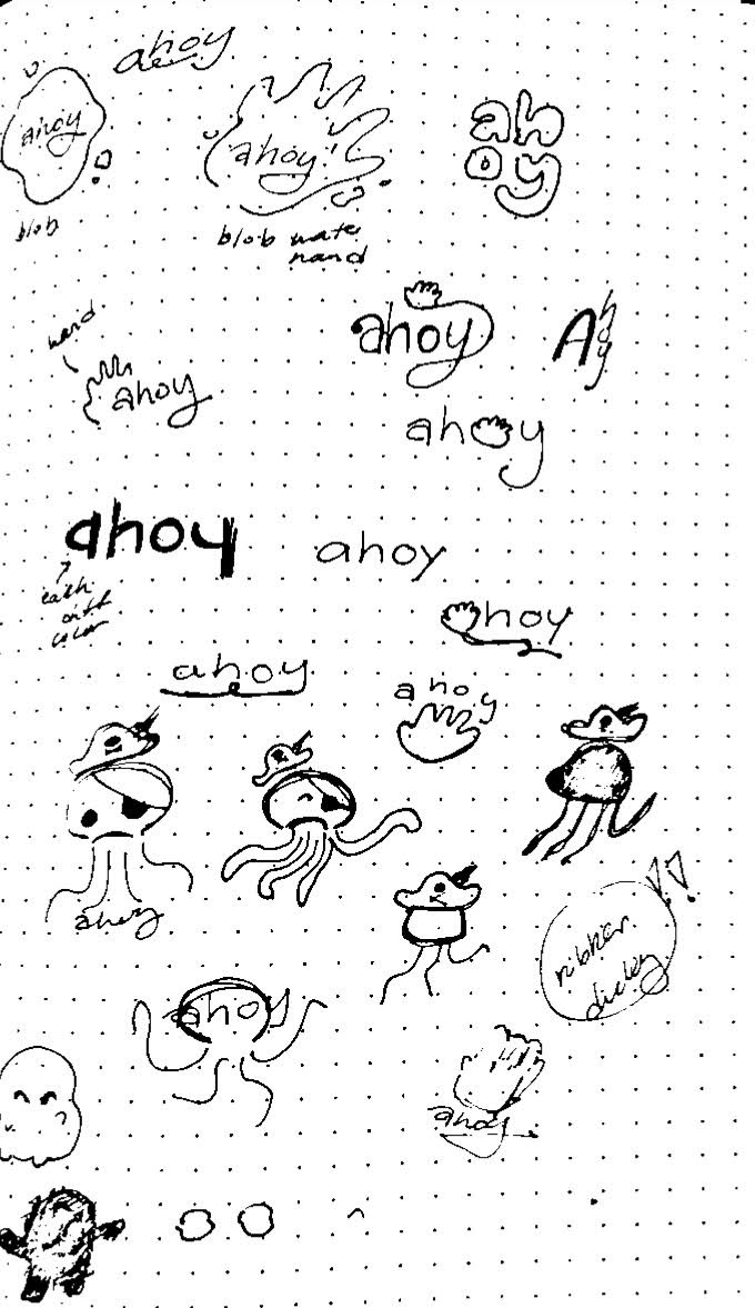
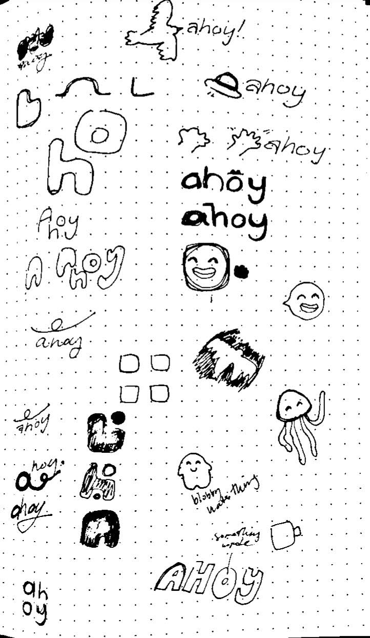
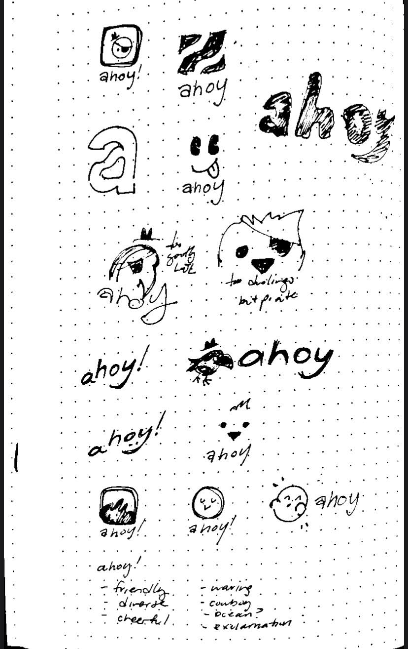
Ideation
// What does Ahoy feel like? //
Sketches
Figma explorations
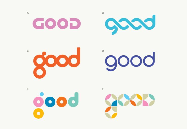
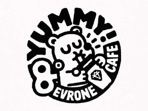
Logo Refinement
Issues
/ Simplicity. The simple approaches were too boring for Ahoy.
/ Typeface. The letters needed some work or other typefaces needed to be explored.
/ Combination of graphic and letters. The logo came across better when the graphic and letters came together to create Ahoy.
Solutions
/ Expressions / personalities. The creation of personalities to have users relate to.
/ Quirkiness. The sort of off kilter-ness works to give off a little more fun.
/ Characters. Fun idea of building characters.
/ Silliness. Onboarding is not fun, so let's add some!
Original characters

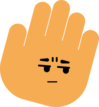
Scrunch

Chirp

Kyle

Topper

Bud
A range of personalities

Scrunch
disinterested / unbothered

Chirp
friendly / upbeat

Kyle
happy / pleasant

Strut
cool / charming

Bud
derpy / silly
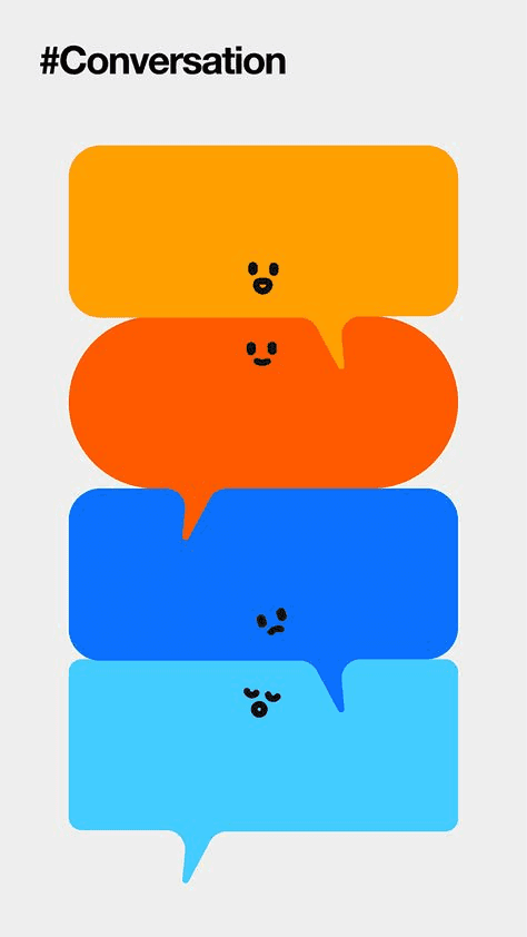
Facial expressions
disinterested / unbothered




Recognizable silhouettes


Fidelity

High fidelity

Medium fidelity

Low fidelity
Typeface explorations

Outcome
☆ Friendly.
☆ Welcoming
☆ Silly.
What’s next?
Check out some other work!
