
01
/
background
ELVTR Course
Game UX/UI - Animal Crossing
Overview
I learned the full UX/UI process by redesigning one Animal Crossing flow, from player research to tested mockups. A solo class project that pushed me to learn research methods and UI art outside my Figma comfort zone.
Role
Solo UX/UI Designer
Duration
5 Weeks
Responsibilities
UX/UI Design · UI Art · User Research
01
/
background
ELVTR Course
Game UX/UI - Animal Crossing
Overview
I learned the full UX/UI process by redesigning one Animal Crossing flow, from player research to tested mockups. A solo class project that pushed me to learn research methods and UI art outside my Figma comfort zone.
Role
Solo UX/UI Designer
Duration
5 Weeks
Responsibilities
UX/UI Design · UI Art · User Research
01
/
background
ELVTR Course
Game UX/UI - Animal Crossing
Overview
I learned the full UX/UI process by redesigning one Animal Crossing flow, from player research to tested mockups. A solo class project that pushed me to learn research methods and UI art outside my Figma comfort zone.
Role
Solo UX/UI Designer
Duration
5 Weeks
Responsibilities
UX/UI Design · UI Art · User Research
01
/
background
ELVTR Course
Game UX/UI - Animal Crossing
Overview
I learned the full UX/UI process by redesigning one Animal Crossing flow, from player research to tested mockups. A solo class project that pushed me to learn research methods and UI art outside my Figma comfort zone.
Role
Solo UX/UI Designer
Duration
5 Weeks
Responsibilities
UX/UI Design · UI Art · User Research
01
/
background
ELVTR Course
Game UX/UI - Animal Crossing
Overview
I learned the full UX/UI process by redesigning one Animal Crossing flow, from player research to tested mockups. A solo class project that pushed me to learn research methods and UI art outside my Figma comfort zone.
Role
Solo UX/UI Designer
Duration
5 Weeks
Responsibilities
UX/UI Design · UI Art · User Research
Challenges
Where I started:
Research was my gap, with little experience in player journeys or flowcharts before this project.
UI art was new territory: I normally design in Figma and had never built UI in Photopea.
Animal Crossing’s museum donation became my practice problem: two separate flows, each buried in heavy dialogue.
Mistakes sent players back through much of the dialogue, punishing misclicks, forgotten items, and speedy players.
results
What I learned: Full UX process on one flow: player research and flowcharts through tested wireframes and mockups.
My solution:
Inventory-first donation: players see what they have before deciding, so mistakes no longer restart the flow.
Both tabs visible: donate and assess show together, active versus inactive, so players keep their place.
Blathers’ fact-sharing stays in the loop, so the flow gets shorter without losing its charm.
Task overlay: a new tasks screen and pinned task, refined through user testing and colorblind checks.
Challenges
Where I started:
Research was my gap, with little experience in player journeys or flowcharts before this project.
UI art was new territory: I normally design in Figma and had never built UI in Photopea.
Animal Crossing’s museum donation became my practice problem: two separate flows, each buried in heavy dialogue.
Mistakes sent players back through much of the dialogue, punishing misclicks, forgotten items, and speedy players.
results
What I learned: Full UX process on one flow: player research and flowcharts through tested wireframes and mockups.
My solution:
Inventory-first donation: players see what they have before deciding, so mistakes no longer restart the flow.
Both tabs visible: donate and assess show together, active versus inactive, so players keep their place.
Blathers’ fact-sharing stays in the loop, so the flow gets shorter without losing its charm.
Task overlay: a new tasks screen and pinned task, refined through user testing and colorblind checks.
Challenges
Where I started:
Research was my gap, with little experience in player journeys or flowcharts before this project.
UI art was new territory: I normally design in Figma and had never built UI in Photopea.
Animal Crossing’s museum donation became my practice problem: two separate flows, each buried in heavy dialogue.
Mistakes sent players back through much of the dialogue, punishing misclicks, forgotten items, and speedy players.
results
What I learned: Full UX process on one flow: player research and flowcharts through tested wireframes and mockups.
My solution:
Inventory-first donation: players see what they have before deciding, so mistakes no longer restart the flow.
Both tabs visible: donate and assess show together, active versus inactive, so players keep their place.
Blathers’ fact-sharing stays in the loop, so the flow gets shorter without losing its charm.
Task overlay: a new tasks screen and pinned task, refined through user testing and colorblind checks.
Challenges
Where I started:
Research was my gap, with little experience in player journeys or flowcharts before this project.
UI art was new territory: I normally design in Figma and had never built UI in Photopea.
Animal Crossing’s museum donation became my practice problem: two separate flows, each buried in heavy dialogue.
Mistakes sent players back through much of the dialogue, punishing misclicks, forgotten items, and speedy players.
results
What I learned: Full UX process on one flow: player research and flowcharts through tested wireframes and mockups.
My solution:
Inventory-first donation: players see what they have before deciding, so mistakes no longer restart the flow.
Both tabs visible: donate and assess show together, active versus inactive, so players keep their place.
Blathers’ fact-sharing stays in the loop, so the flow gets shorter without losing its charm.
Task overlay: a new tasks screen and pinned task, refined through user testing and colorblind checks.
Challenges
Where I started:
Research was my gap, with little experience in player journeys or flowcharts before this project.
UI art was new territory: I normally design in Figma and had never built UI in Photopea.
Animal Crossing’s museum donation became my practice problem: two separate flows, each buried in heavy dialogue.
Mistakes sent players back through much of the dialogue, punishing misclicks, forgotten items, and speedy players.
results
What I learned: Full UX process on one flow: player research and flowcharts through tested wireframes and mockups.
My solution:
Inventory-first donation: players see what they have before deciding, so mistakes no longer restart the flow.
Both tabs visible: donate and assess show together, active versus inactive, so players keep their place.
Blathers’ fact-sharing stays in the loop, so the flow gets shorter without losing its charm.
Task overlay: a new tasks screen and pinned task, refined through user testing and colorblind checks.
02
/
process
Learning UX by Studying Players
Learning UX design meant learning to see the game through the player's eyes before designing anything. Each method answered a different question, and together they showed me where a simple-looking flow breaks down.
Player journey: taught me to ask why players make each decision, not just what they do.
Paper prototype: showed me what players actually see at each choice, exposing moments with too little context.
Flowchart: taught me that arrows and steps make complexity visible, revealing separate flows where mistakes become costly.
User testing: taught me to separate what I observed from what I interpreted
Learning UX by Studying Players
Learning UX design meant learning to see the game through the player's eyes before designing anything. Each method answered a different question, and together they showed me where a simple-looking flow breaks down.
Player journey: taught me to ask why players make each decision, not just what they do.
Paper prototype: showed me what players actually see at each choice, exposing moments with too little context.
Flowchart: taught me that arrows and steps make complexity visible, revealing separate flows where mistakes become costly.
User testing: taught me to separate what I observed from what I interpreted
Learning UX by Studying Players
Learning UX design meant learning to see the game through the player's eyes before designing anything. Each method answered a different question, and together they showed me where a simple-looking flow breaks down.
Player journey: taught me to ask why players make each decision, not just what they do.
Paper prototype: showed me what players actually see at each choice, exposing moments with too little context.
Flowchart: taught me that arrows and steps make complexity visible, revealing separate flows where mistakes become costly.
User testing: taught me to separate what I observed from what I interpreted
02
/
process
Learning UX by Studying Players
Learning UX design meant learning to see the game through the player's eyes before designing anything. Each method answered a different question, and together they showed me where a simple-looking flow breaks down.
Player journey: taught me to ask why players make each decision, not just what they do.
Paper prototype: showed me what players actually see at each choice, exposing moments with too little context.
Flowchart: taught me that arrows and steps make complexity visible, revealing separate flows where mistakes become costly.
User testing: taught me to separate what I observed from what I interpreted
02
/
process
Learning UX by Studying Players
Learning UX design meant learning to see the game through the player's eyes before designing anything. Each method answered a different question, and together they showed me where a simple-looking flow breaks down.
Player journey: taught me to ask why players make each decision, not just what they do.
Paper prototype: showed me what players actually see at each choice, exposing moments with too little context.
Flowchart: taught me that arrows and steps make complexity visible, revealing separate flows where mistakes become costly.
User testing: taught me to separate what I observed from what I interpreted
Research
Player Journey
Attempting to understand the player’s motivation was the starting point, so I studied a playthrough of Animal Crossing’s opening stages. Through each step, I asked myself these questions:
What does the player see on screen?
What does the player think, feel, and say?
What decision does the player make next?
Why that decision, and what is the player trying to solve?
Experiencing the game from the player's POV surfaced 3 initial pain points, most notably asking the player to make decisions without giving them the full picture / instruction.
To see the full research: Kristiana_ACNH_ELVTR
Research
Player Journey
Attempting to understand the player’s motivation was the starting point, so I studied a playthrough of Animal Crossing’s opening stages. Through each step, I asked myself these questions:
What does the player see on screen?
What does the player think, feel, and say?
What decision does the player make next?
Why that decision, and what is the player trying to solve?
Experiencing the game from the player's POV surfaced 3 initial pain points, most notably asking the player to make decisions without giving them the full picture / instruction.
To see the full research: Kristiana_ACNH_ELVTR
Research
Player Journey
Attempting to understand the player’s motivation was the starting point, so I studied a playthrough of Animal Crossing’s opening stages. Through each step, I asked myself these questions:
What does the player see on screen?
What does the player think, feel, and say?
What decision does the player make next?
Why that decision, and what is the player trying to solve?
Experiencing the game from the player's POV surfaced 3 initial pain points, most notably asking the player to make decisions without giving them the full picture / instruction.
To see the full research: Kristiana_ACNH_ELVTR
Research
Player Journey
Attempting to understand the player’s motivation was the starting point, so I studied a playthrough of Animal Crossing’s opening stages. Through each step, I asked myself these questions:
What does the player see on screen?
What does the player think, feel, and say?
What decision does the player make next?
Why that decision, and what is the player trying to solve?
Experiencing the game from the player's POV surfaced 3 initial pain points, most notably asking the player to make decisions without giving them the full picture / instruction.
To see the full research: Kristiana_ACNH_ELVTR
Research
Player Journey
Attempting to understand the player’s motivation was the starting point, so I studied a playthrough of Animal Crossing’s opening stages. Through each step, I asked myself these questions:
What does the player see on screen?
What does the player think, feel, and say?
What decision does the player make next?
Why that decision, and what is the player trying to solve?
Experiencing the game from the player's POV surfaced 3 initial pain points, most notably asking the player to make decisions without giving them the full picture / instruction.
To see the full research: Kristiana_ACNH_ELVTR



Paper Prototype
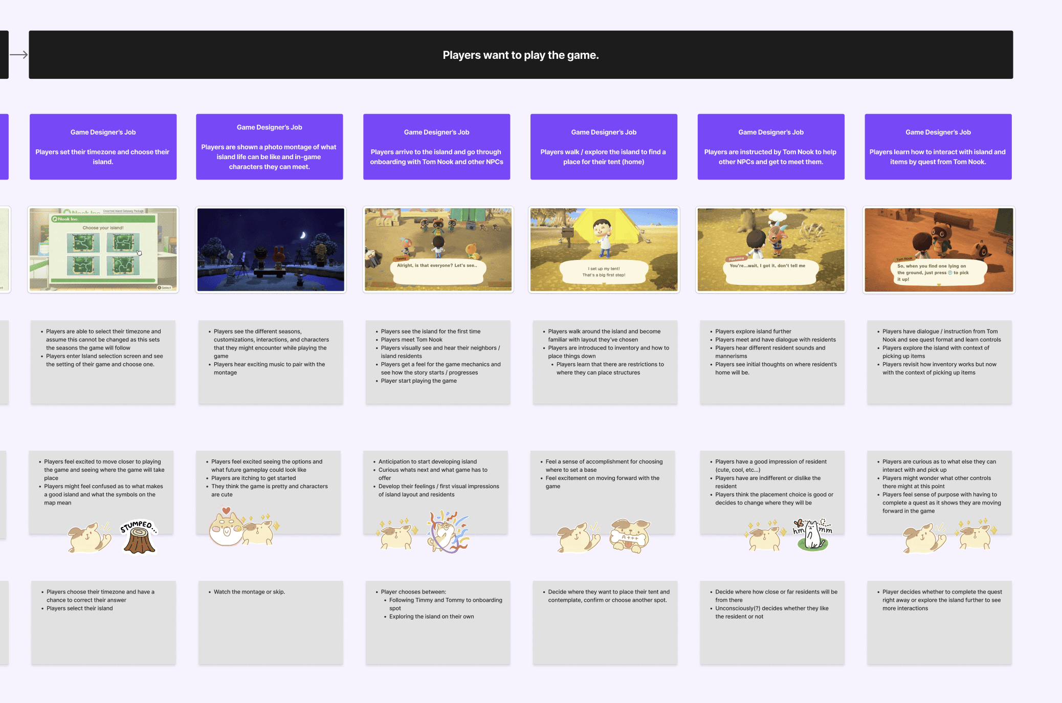
I cataloged every decision in the setup and tutorial stages and mapped each one against the player journey. This revealed that even simple choices have complex layers and several moments that give too little context to make decisions confidently.
To see the full research: Kristiana_ACNH_ELVTR
Paper Prototype
I cataloged every decision in the setup and tutorial stages and mapped each one against the player journey. This revealed that even simple choices have complex layers and several moments that give too little context to make decisions confidently.
To see the full research: Kristiana_ACNH_ELVTR
Paper Prototype
I cataloged every decision in the setup and tutorial stages and mapped each one against the player journey. This revealed that even simple choices have complex layers and several moments that give too little context to make decisions confidently.
To see the full research: Kristiana_ACNH_ELVTR
Paper Prototype
I cataloged every decision in the setup and tutorial stages and mapped each one against the player journey. This revealed that even simple choices have complex layers and several moments that give too little context to make decisions confidently.
To see the full research: Kristiana_ACNH_ELVTR
Paper Prototype
I cataloged every decision in the setup and tutorial stages and mapped each one against the player journey. This revealed that even simple choices have complex layers and several moments that give too little context to make decisions confidently.
To see the full research: Kristiana_ACNH_ELVTR


Then I added a more complex flow to learn from.
In the museum donation gameplay, the dialogue loop revealed that it was punishing players who misclick, forget what they’re carrying or just want to donate and go. A wrong guess forces them back through full dialogue before they can correct it, making it frustration for speedy players.
My recommendation was to open the inventory first, so players can see what they have before they decide. That removes unnecessary dialogue and the guesswork, and it speeds up the loop.
Then I added a more complex flow to learn from.
In the museum donation gameplay, the dialogue loop revealed that it was punishing players who misclick, forget what they’re carrying or just want to donate and go. A wrong guess forces them back through full dialogue before they can correct it, making it frustration for speedy players.
My recommendation was to open the inventory first, so players can see what they have before they decide. That removes unnecessary dialogue and the guesswork, and it speeds up the loop.
Then I added a more complex flow to learn from.
In the museum donation gameplay, the dialogue loop revealed that it was punishing players who misclick, forget what they’re carrying or just want to donate and go. A wrong guess forces them back through full dialogue before they can correct it, making it frustration for speedy players.
My recommendation was to open the inventory first, so players can see what they have before they decide. That removes unnecessary dialogue and the guesswork, and it speeds up the loop.
Then I added a more complex flow to learn from.
In the museum donation gameplay, the dialogue loop revealed that it was punishing players who misclick, forget what they’re carrying or just want to donate and go. A wrong guess forces them back through full dialogue before they can correct it, making it frustration for speedy players.
My recommendation was to open the inventory first, so players can see what they have before they decide. That removes unnecessary dialogue and the guesswork, and it speeds up the loop.
Then I added a more complex flow to learn from.
In the museum donation gameplay, the dialogue loop revealed that it was punishing players who misclick, forget what they’re carrying or just want to donate and go. A wrong guess forces them back through full dialogue before they can correct it, making it frustration for speedy players.
My recommendation was to open the inventory first, so players can see what they have before they decide. That removes unnecessary dialogue and the guesswork, and it speeds up the loop.

flow chart
The flowchart added direction to the paper prototype's decisions. Where the prototype showed what players see at each choice, the flowchart mapped how those choices connect and progress.
Its arrows and steps made the game's complexity visible at a glance, which helped me pinpoint areas to improve.
To see the full research: Kristiana_ACNH_ELVTR
flow chart
The flowchart added direction to the paper prototype's decisions. Where the prototype showed what players see at each choice, the flowchart mapped how those choices connect and progress.
Its arrows and steps made the game's complexity visible at a glance, which helped me pinpoint areas to improve.
To see the full research: Kristiana_ACNH_ELVTR
flow chart
The flowchart added direction to the paper prototype's decisions. Where the prototype showed what players see at each choice, the flowchart mapped how those choices connect and progress.
Its arrows and steps made the game's complexity visible at a glance, which helped me pinpoint areas to improve.
To see the full research: Kristiana_ACNH_ELVTR
flow chart
The flowchart added direction to the paper prototype's decisions. Where the prototype showed what players see at each choice, the flowchart mapped how those choices connect and progress.
Its arrows and steps made the game's complexity visible at a glance, which helped me pinpoint areas to improve.
To see the full research: Kristiana_ACNH_ELVTR
flow chart
The flowchart added direction to the paper prototype's decisions. Where the prototype showed what players see at each choice, the flowchart mapped how those choices connect and progress.
Its arrows and steps made the game's complexity visible at a glance, which helped me pinpoint areas to improve.
To see the full research: Kristiana_ACNH_ELVTR
Onboarding flow
Onboarding flow
Onboarding flow
Onboarding flow
Onboarding flow

tutorial flow
tutorial flow
tutorial flow
tutorial flow
tutorial flow

museum donation flow
Although museum donation looked simple, the chart showed that donating an item and assessing a fossil as separate flows, so cancelling or forgetting an item sends players back through the dialogue from the start.
museum donation flow
Although museum donation looked simple, the chart showed that donating an item and assessing a fossil as separate flows, so cancelling or forgetting an item sends players back through the dialogue from the start.
museum donation flow
Although museum donation looked simple, the chart showed that donating an item and assessing a fossil as separate flows, so cancelling or forgetting an item sends players back through the dialogue from the start.
museum donation flow
Although museum donation looked simple, the chart showed that donating an item and assessing a fossil as separate flows, so cancelling or forgetting an item sends players back through the dialogue from the start.
museum donation flow
Although museum donation looked simple, the chart showed that donating an item and assessing a fossil as separate flows, so cancelling or forgetting an item sends players back through the dialogue from the start.

revised museum donation
My revised flow puts everything on one inventory screen, so players can switch tabs, change their mind, or add a forgotten item without restarting an entire dialogue. Some dialogue remains, but it's shorter because the path-selection steps are gone.
revised museum donation
My revised flow puts everything on one inventory screen, so players can switch tabs, change their mind, or add a forgotten item without restarting an entire dialogue. Some dialogue remains, but it's shorter because the path-selection steps are gone.
revised museum donation
My revised flow puts everything on one inventory screen, so players can switch tabs, change their mind, or add a forgotten item without restarting an entire dialogue. Some dialogue remains, but it's shorter because the path-selection steps are gone.
revised museum donation
My revised flow puts everything on one inventory screen, so players can switch tabs, change their mind, or add a forgotten item without restarting an entire dialogue. Some dialogue remains, but it's shorter because the path-selection steps are gone.
revised museum donation
My revised flow puts everything on one inventory screen, so players can switch tabs, change their mind, or add a forgotten item without restarting an entire dialogue. Some dialogue remains, but it's shorter because the path-selection steps are gone.

Low-Fidelity Design + User Testing
wireframes
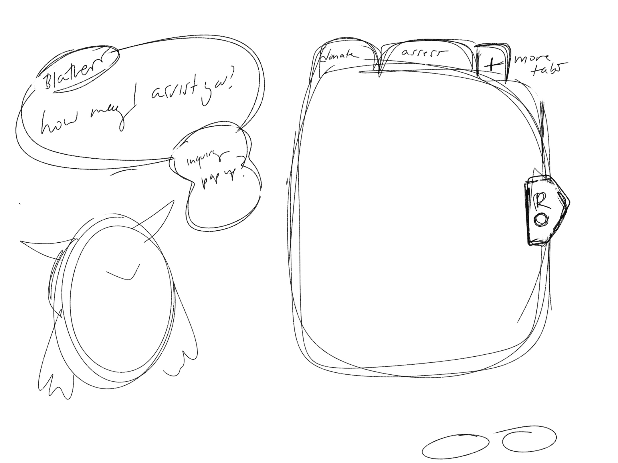
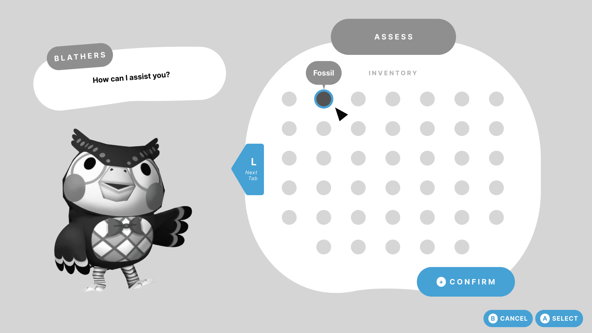
I sketched low-fidelity wireframes, built them in Figma, and tested them with one Animal Crossing player.
Low-Fidelity Design + User Testing
wireframes
I sketched low-fidelity wireframes, built them in Figma, and tested them with one Animal Crossing player.
Low-Fidelity Design + User Testing
wireframes
I sketched low-fidelity wireframes, built them in Figma, and tested them with one Animal Crossing player.
Low-Fidelity Design + User Testing
wireframes
I sketched low-fidelity wireframes, built them in Figma, and tested them with one Animal Crossing player.
Low-Fidelity Design + User Testing
wireframes
I sketched low-fidelity wireframes, built them in Figma, and tested them with one Animal Crossing player.



usability testing
Wireframe 1 tested whether a task screen and pinned task earned a place on the main overlay, and wireframe 2 tested whether the inventory-first museum donation beats the current flow.
To see the full research: Kristiana_ACNH_ELVTR
usability testing
Wireframe 1 tested whether a task screen and pinned task earned a place on the main overlay, and wireframe 2 tested whether the inventory-first museum donation beats the current flow.
To see the full research: Kristiana_ACNH_ELVTR
usability testing
Wireframe 1 tested whether a task screen and pinned task earned a place on the main overlay, and wireframe 2 tested whether the inventory-first museum donation beats the current flow.
To see the full research: Kristiana_ACNH_ELVTR
usability testing
Wireframe 1 tested whether a task screen and pinned task earned a place on the main overlay, and wireframe 2 tested whether the inventory-first museum donation beats the current flow.
To see the full research: Kristiana_ACNH_ELVTR
usability testing
Wireframe 1 tested whether a task screen and pinned task earned a place on the main overlay, and wireframe 2 tested whether the inventory-first museum donation beats the current flow.
To see the full research: Kristiana_ACNH_ELVTR
Wireframe 1 / Research Objective 1
Can players understand where tasks live without prompt and guess the function?
Is the proposed method of showing tasks needed in the game or is it clutter on the screen?
Wireframe 2 / Research Objective 2
Can players understand how to complete a task without assistance?
>> Specifically, can players figure out how to donate an item to Blathers (museum)?
Is the proposed method of donating / assessing items with Blathers more efficient than the current method in the game?
>> How pleasant is it to use this design vs. the current method?
Revisions
Revisions
Revisions
Revisions
Revisions
wireframe 1 / results
Player noticed all three interactive components quickly, so the new overlay elements are easy to spot at a glance.
Tasks button felt redundant, though it's meant as a faster list including discovered tasks outside Nook Miles.
Pinned task landed well, so it should carry the value of the task feature going forward.
Changes: Tasks screen fleshed out in detail, which clarifies how the task button is different compared to the phone.
wireframe 2 / results
Donation finished quickly and silently, with only soft "oh" sounds as the player moved through each step.
Surprise came at the end, when the fossil reappeared on the donate screen after assessing.
Visual blindness between tabs was my read: she moved through the motions without visibly grasping why assessing comes first.
Changes: Donate and assess tabs now appear together, active versus inactive, instead of one tab at a time + added Blathers' fact-sharing


03
/
Design
UI Art / Design
Building the mockups in Photopea, a free Photoshop alternative, took a few tries after working mainly in Figma, but it brought my wireframes to life and gave me an appreciation for a different kind of art / design.
UI Art was created by me. Assets (items & NPCs were found on the internet or came from the Animal Crossing UI Kit
03
/
Design
UI Art / Design
Building the mockups in Photopea, a free Photoshop alternative, took a few tries after working mainly in Figma, but it brought my wireframes to life and gave me an appreciation for a different kind of art / design.
UI Art was created by me. Assets (items & NPCs were found on the internet or came from the Animal Crossing UI Kit
03
/
Design
UI Art / Design
Building the mockups in Photopea, a free Photoshop alternative, took a few tries after working mainly in Figma, but it brought my wireframes to life and gave me an appreciation for a different kind of art / design.
UI Art was created by me. Assets (items & NPCs were found on the internet or came from the Animal Crossing UI Kit
UI Art / Design
Building the mockups in Photopea, a free Photoshop alternative, took a few tries after working mainly in Figma, but it brought my wireframes to life and gave me an appreciation for a different kind of art / design.
UI Art was created by me. Assets (items & NPCs were found on the internet or came from the Animal Crossing UI Kit
UI Art / Design
Building the mockups in Photopea, a free Photoshop alternative, took a few tries after working mainly in Figma, but it brought my wireframes to life and gave me an appreciation for a different kind of art / design.
UI Art was created by me. Assets (items & NPCs were found on the internet or came from the Animal Crossing UI Kit
style guide
I based my style guide on the game's existing UI, documenting my color swatches and reusable components.
I kept the game's look mostly intact and added patterned backgrounds to the tabs and task screen. They were the main areas that could use a bit of personality without damaging the experience.
style guide
I based my style guide on the game's existing UI, documenting my color swatches and reusable components.
I kept the game's look mostly intact and added patterned backgrounds to the tabs and task screen. They were the main areas that could use a bit of personality without damaging the experience.
style guide
I based my style guide on the game's existing UI, documenting my color swatches and reusable components.
I kept the game's look mostly intact and added patterned backgrounds to the tabs and task screen. They were the main areas that could use a bit of personality without damaging the experience.
style guide
I based my style guide on the game's existing UI, documenting my color swatches and reusable components.
I kept the game's look mostly intact and added patterned backgrounds to the tabs and task screen. They were the main areas that could use a bit of personality without damaging the experience.
style guide
I based my style guide on the game's existing UI, documenting my color swatches and reusable components.
I kept the game's look mostly intact and added patterned backgrounds to the tabs and task screen. They were the main areas that could use a bit of personality without damaging the experience.

UI Mockups
Items appear for the first time here, so I highlighted which are donatable versus assessable to ease the visual blindness from testing. Seeing the screen in context with the setting and npcs added clarity to my idea.
UI Mockups
Items appear for the first time here, so I highlighted which are donatable versus assessable to ease the visual blindness from testing. Seeing the screen in context with the setting and npcs added clarity to my idea.
UI Mockups
Items appear for the first time here, so I highlighted which are donatable versus assessable to ease the visual blindness from testing. Seeing the screen in context with the setting and npcs added clarity to my idea.
UI Mockups
Items appear for the first time here, so I highlighted which are donatable versus assessable to ease the visual blindness from testing. Seeing the screen in context with the setting and npcs added clarity to my idea.
UI Mockups
Items appear for the first time here, so I highlighted which are donatable versus assessable to ease the visual blindness from testing. Seeing the screen in context with the setting and npcs added clarity to my idea.


Color blind testing
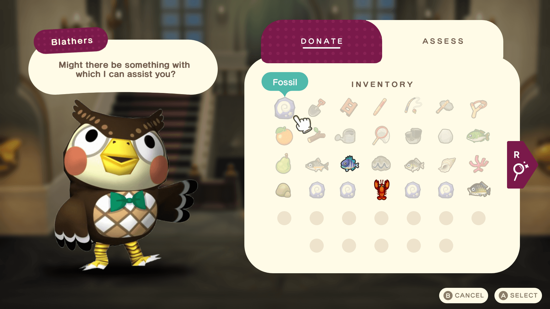
I ran all four mockups through the Coblis simulator across all eight color vision types. Comparing them side by side, I pinpointed the elements with contrast and visibility issues.
Each issue led to a revision:
Donation screen background lightened, so the arrows stand out more clearly.
Pinned task color changed from dark grey-brown to white, matching the other UI and improving visibility above gameplay.
Selected task indicator switched from fill to outline, separating it more clearly from the button overlay.
Color blind testing
I ran all four mockups through the Coblis simulator across all eight color vision types. Comparing them side by side, I pinpointed the elements with contrast and visibility issues.
Each issue led to a revision:
Donation screen background lightened, so the arrows stand out more clearly.
Pinned task color changed from dark grey-brown to white, matching the other UI and improving visibility above gameplay.
Selected task indicator switched from fill to outline, separating it more clearly from the button overlay.
Color blind testing
I ran all four mockups through the Coblis simulator across all eight color vision types. Comparing them side by side, I pinpointed the elements with contrast and visibility issues.
Each issue led to a revision:
Donation screen background lightened, so the arrows stand out more clearly.
Pinned task color changed from dark grey-brown to white, matching the other UI and improving visibility above gameplay.
Selected task indicator switched from fill to outline, separating it more clearly from the button overlay.
Color blind testing
I ran all four mockups through the Coblis simulator across all eight color vision types. Comparing them side by side, I pinpointed the elements with contrast and visibility issues.
Each issue led to a revision:
Donation screen background lightened, so the arrows stand out more clearly.
Pinned task color changed from dark grey-brown to white, matching the other UI and improving visibility above gameplay.
Selected task indicator switched from fill to outline, separating it more clearly from the button overlay.
Color blind testing
I ran all four mockups through the Coblis simulator across all eight color vision types. Comparing them side by side, I pinpointed the elements with contrast and visibility issues.
Each issue led to a revision:
Donation screen background lightened, so the arrows stand out more clearly.
Pinned task color changed from dark grey-brown to white, matching the other UI and improving visibility above gameplay.
Selected task indicator switched from fill to outline, separating it more clearly from the button overlay.


revised UI Mockups
revised UI Mockups
revised UI Mockups
revised UI Mockups
revised UI Mockups


04
/
results
takeaways
I completed a full UX-to-UI cycle: journey, prototype, flowchart, wireframes, tested mockups, and a style guide. One tester completed both tasks quickly, so I treat the findings as early signals.
Research felt confusing at first, but asking questions got me through the journey, prototype, and flowchart.
UI art felt intimidating, more art than design, but became doable with practice.
Games hide complexity: every simple moment holds layers of decisions players can get wrong, mixing player logic and game logic.
With more scope, I'd test the mockups and revisit other ideas from the start. That would turn early signals into real conclusions.
04
/
results
takeaways
I completed a full UX-to-UI cycle: journey, prototype, flowchart, wireframes, tested mockups, and a style guide. One tester completed both tasks quickly, so I treat the findings as early signals.
Research felt confusing at first, but asking questions got me through the journey, prototype, and flowchart.
UI art felt intimidating, more art than design, but became doable with practice.
Games hide complexity: every simple moment holds layers of decisions players can get wrong, mixing player logic and game logic.
With more scope, I'd test the mockups and revisit other ideas from the start. That would turn early signals into real conclusions.
04
/
results
takeaways
I completed a full UX-to-UI cycle: journey, prototype, flowchart, wireframes, tested mockups, and a style guide. One tester completed both tasks quickly, so I treat the findings as early signals.
Research felt confusing at first, but asking questions got me through the journey, prototype, and flowchart.
UI art felt intimidating, more art than design, but became doable with practice.
Games hide complexity: every simple moment holds layers of decisions players can get wrong, mixing player logic and game logic.
With more scope, I'd test the mockups and revisit other ideas from the start. That would turn early signals into real conclusions.
takeaways
I completed a full UX-to-UI cycle: journey, prototype, flowchart, wireframes, tested mockups, and a style guide. One tester completed both tasks quickly, so I treat the findings as early signals.
Research felt confusing at first, but asking questions got me through the journey, prototype, and flowchart.
UI art felt intimidating, more art than design, but became doable with practice.
Games hide complexity: every simple moment holds layers of decisions players can get wrong, mixing player logic and game logic.
With more scope, I'd test the mockups and revisit other ideas from the start. That would turn early signals into real conclusions.
takeaways
I completed a full UX-to-UI cycle: journey, prototype, flowchart, wireframes, tested mockups, and a style guide. One tester completed both tasks quickly, so I treat the findings as early signals.
Research felt confusing at first, but asking questions got me through the journey, prototype, and flowchart.
UI art felt intimidating, more art than design, but became doable with practice.
Games hide complexity: every simple moment holds layers of decisions players can get wrong, mixing player logic and game logic.
With more scope, I'd test the mockups and revisit other ideas from the start. That would turn early signals into real conclusions.

